Fintech · Mobile Applications
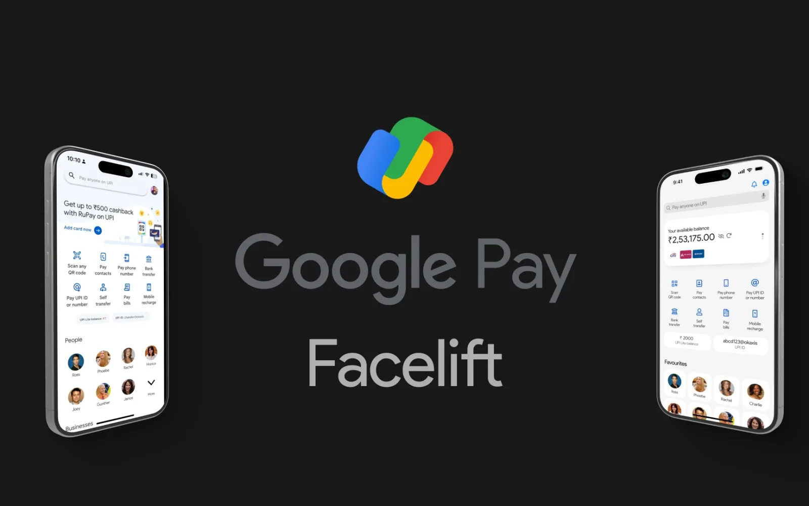
Google Pay Facelift
A research-led rethink of Google Pay India — fewer steps, clearer search, and a home screen built around the people you pay most.
- Client
- Self-initiated concept
- Industry
- Fintech
- Year
- 2024
- Platforms
- iOS · Android
- Role
- UX research & product design
- Timeline
- 2024
01
Project overview
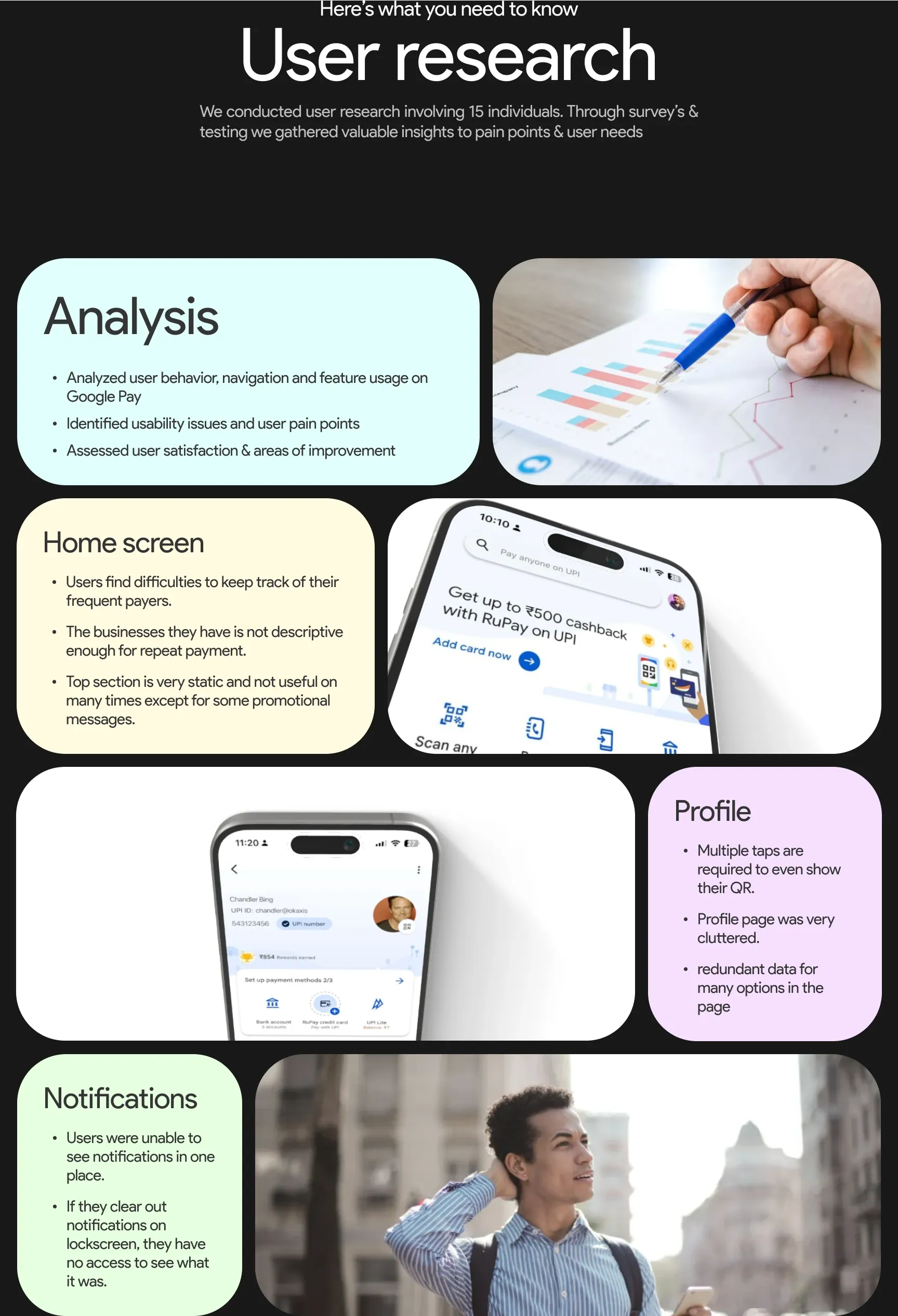
Google Pay’s design focuses on ease of transactions — QR scanning and UPI payments. But user studies revealed clear room for improvement in transaction history, payment options and feature discoverability. This self-initiated case study redesigns the experience from the ground up.
02
User problems
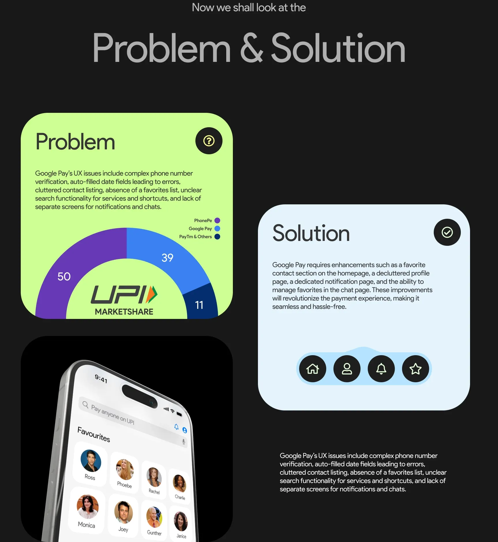
- Complex phone-number verification
- Auto-filled date fields leading to errors
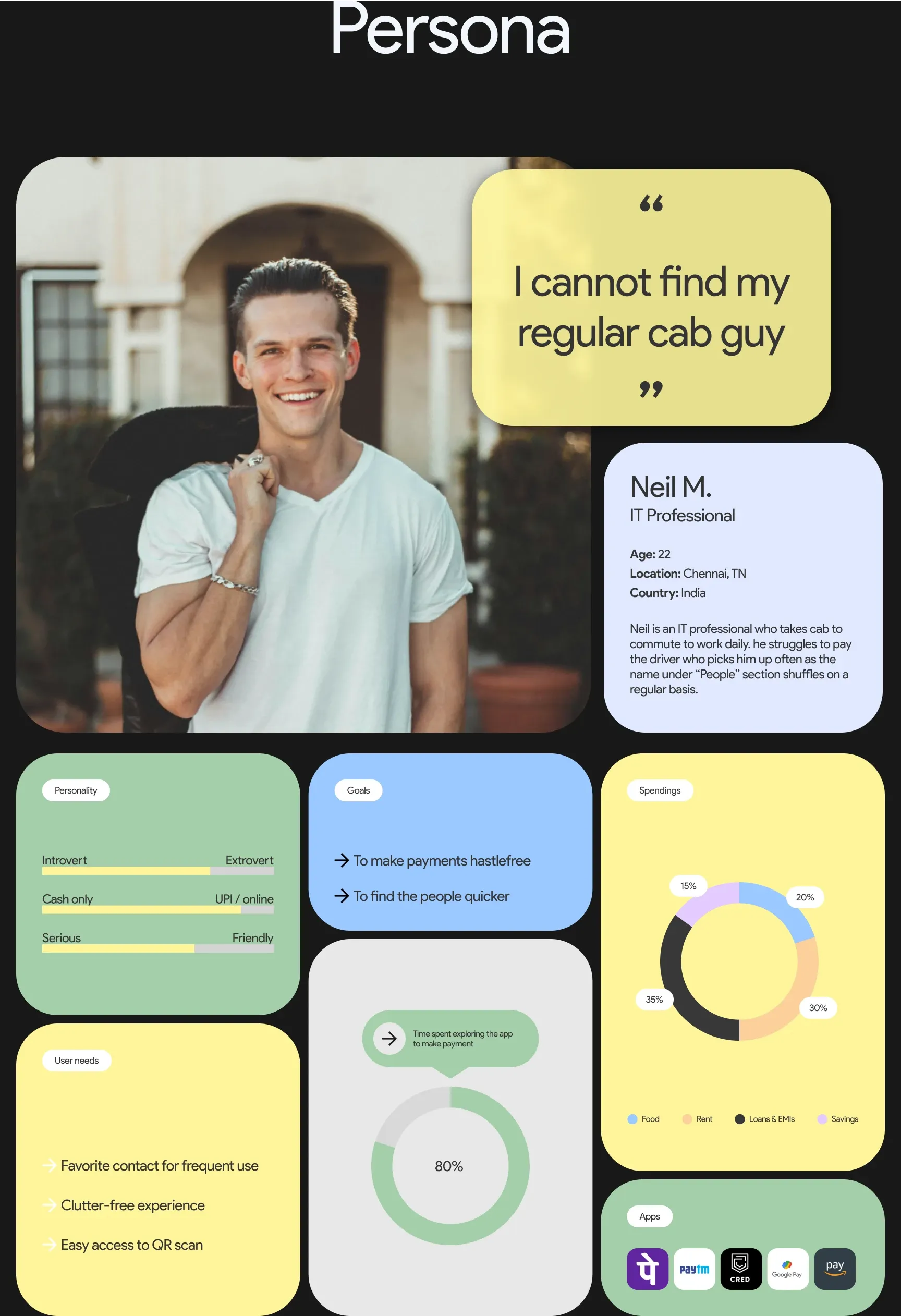
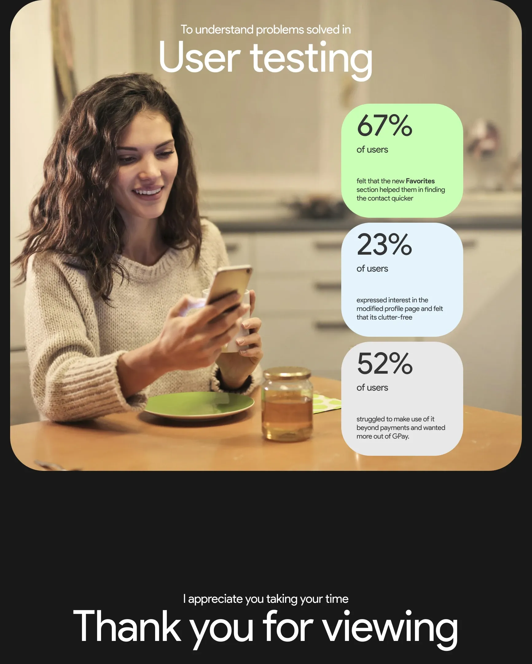
- A cluttered contact listing with no favourites
- Unclear search for services and shortcuts
- No separate screens for notifications and chats
03
Research & discovery
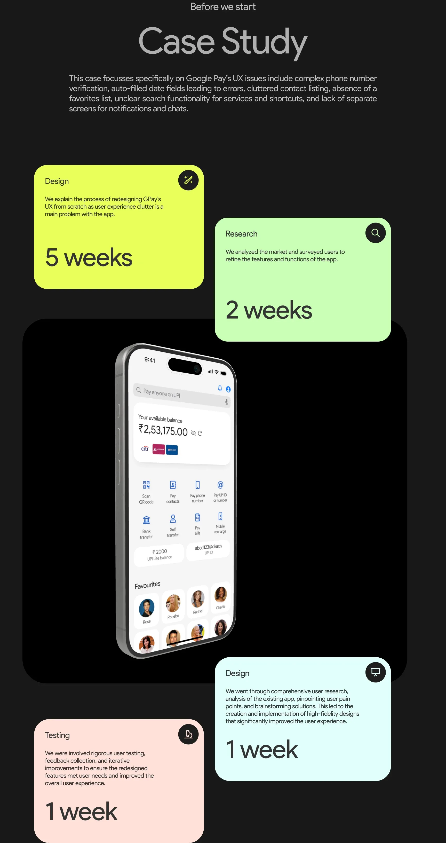
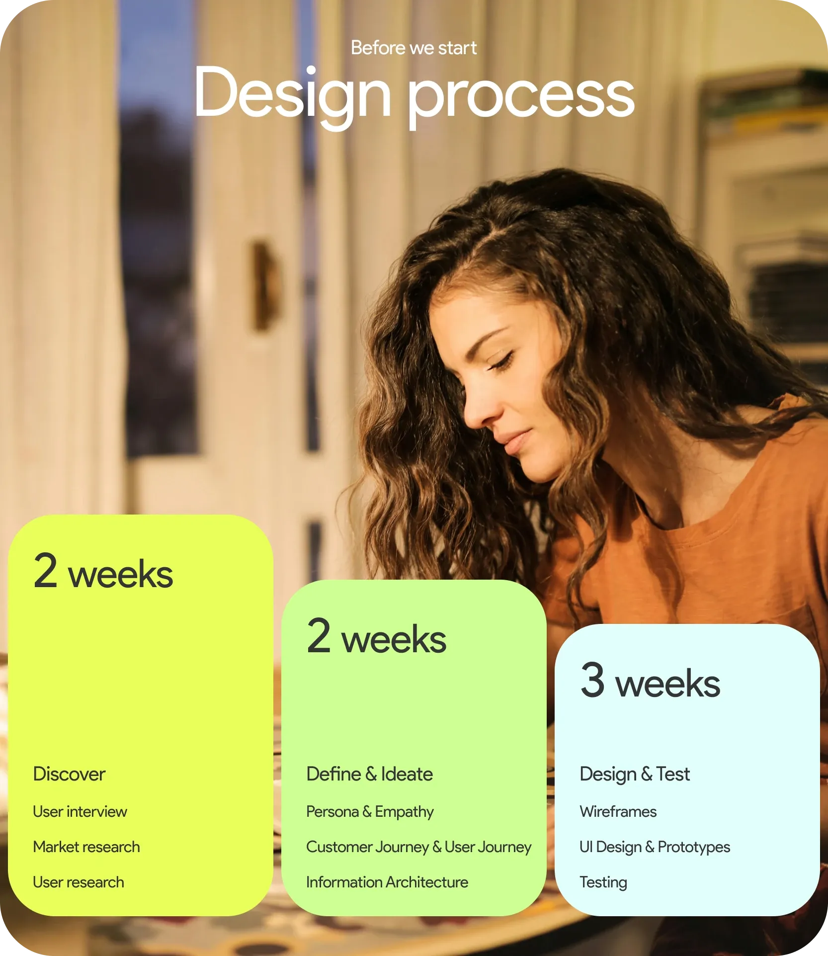
We analysed the market and surveyed users to refine the features and functions of the app, then analysed the existing app to pinpoint pain points before brainstorming solutions.
04
Final experience
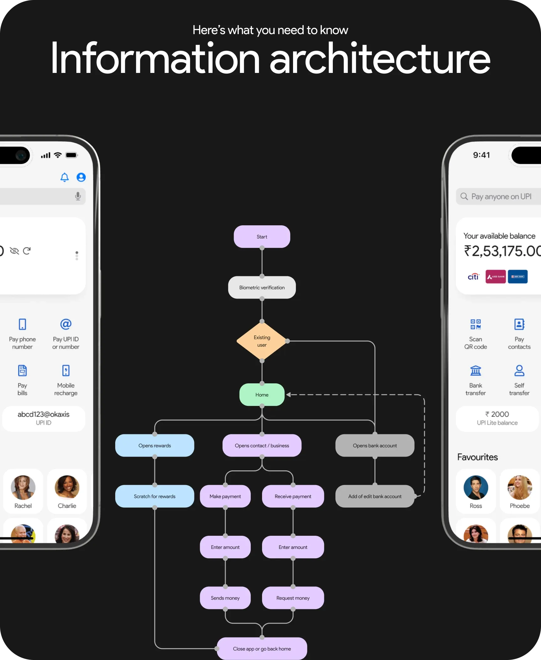
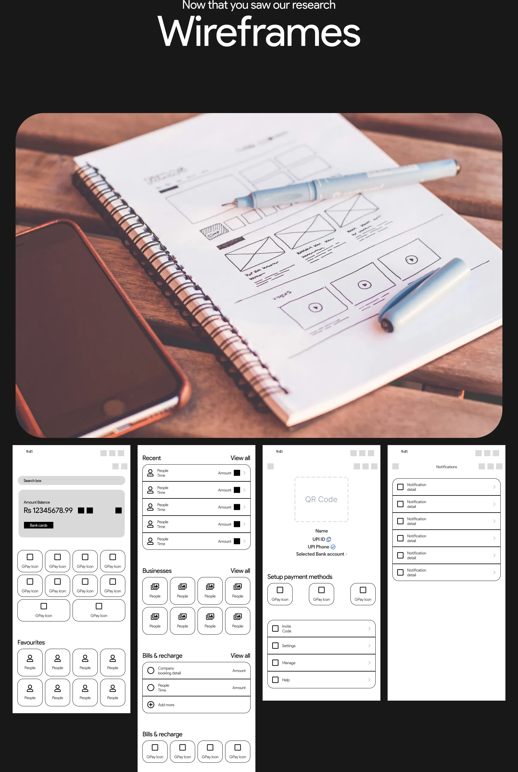
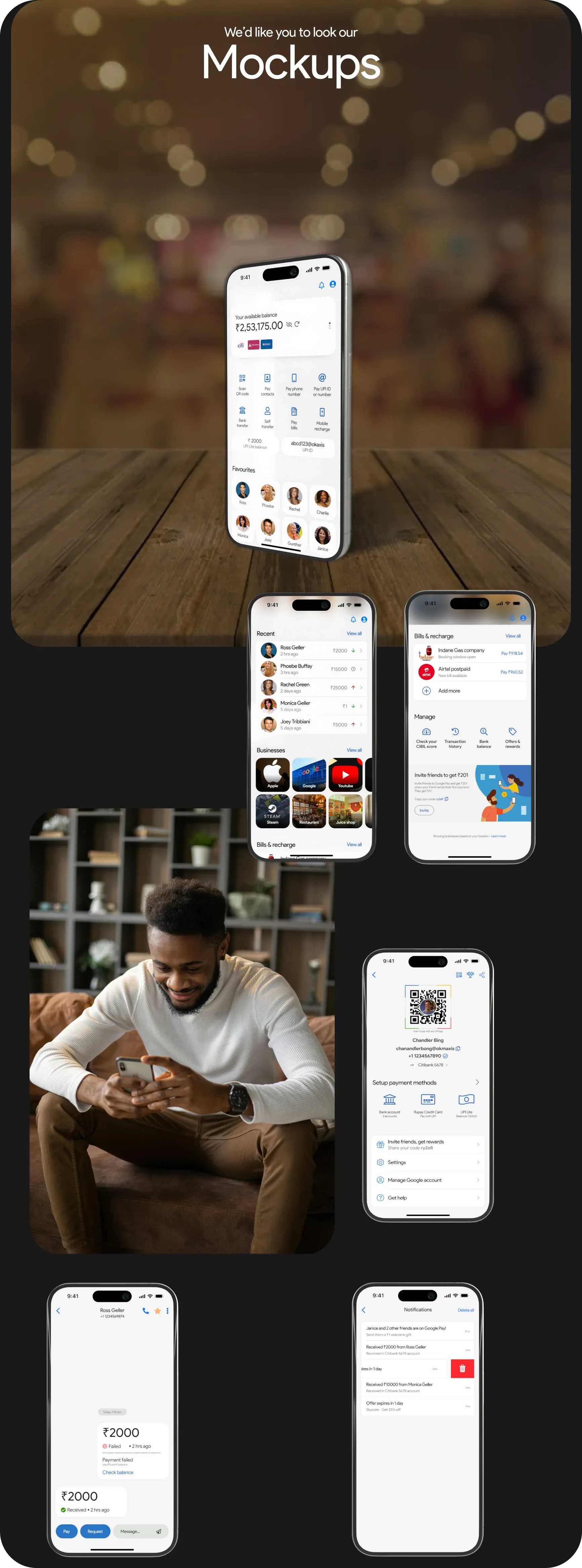
A calmer home screen with available balance up front, a clear grid of payment actions, UPI Lite balance and ID at a glance, and a Favourites row for the people you pay most.
05
My role & contributions
- User research and analysis of the existing app
- High-fidelity redesign and prototyping
- User testing and iteration
06
Tools & technologies
- Figma
Visual documentation
Related projects
Collectibles · Product Design · 2026
VIIV
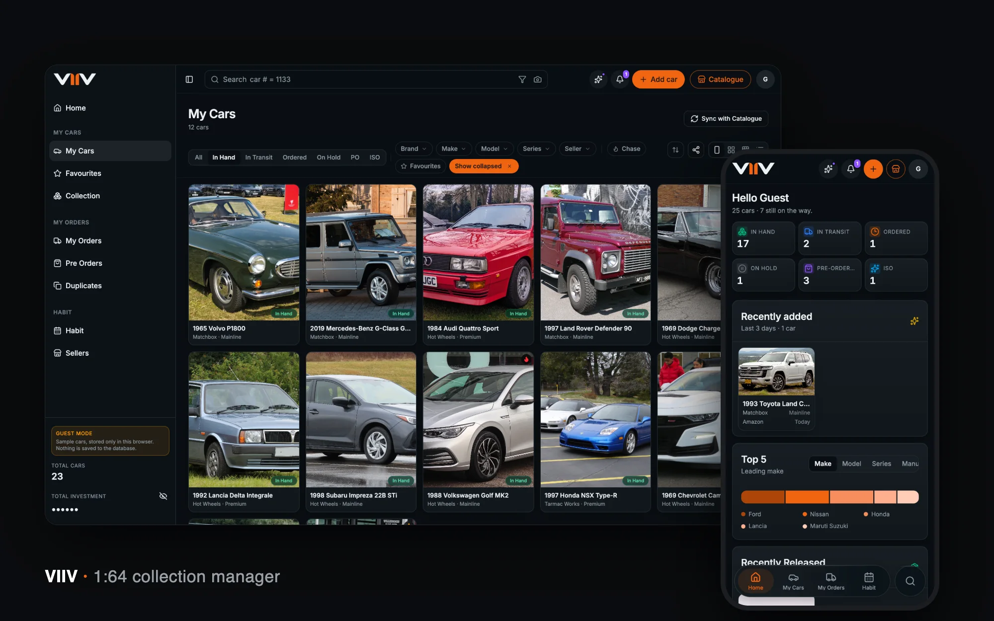
A home for a 1:64 diecast collection — catalogue, card scan, orders, spend and habits — designed and built end to end in seven weeks.
View case study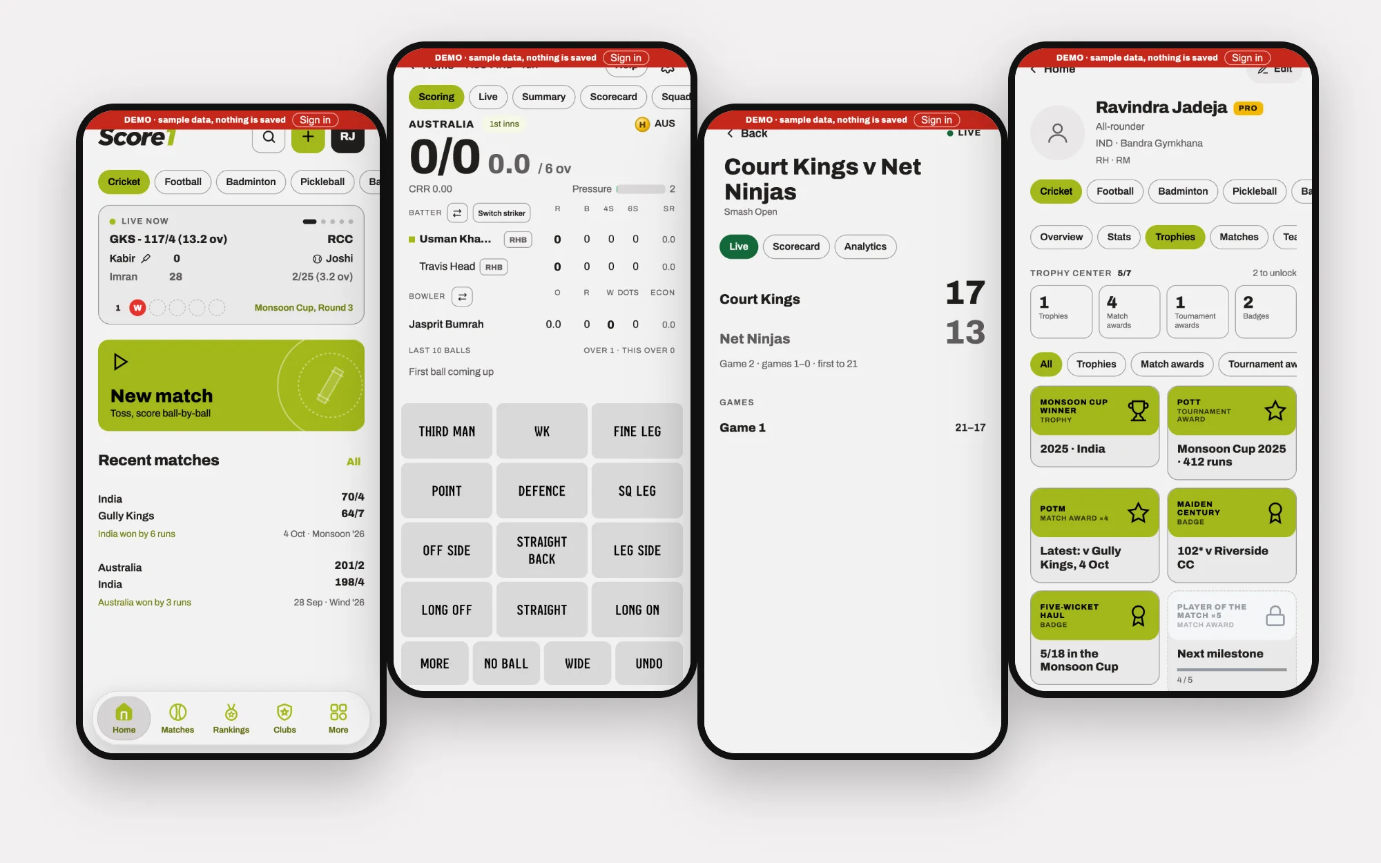
Amateur sport · Product Design · 2026
Score1
One app for scoring, tracking and connecting across nine sports — with the scoring depth cricket needs and the community tools clubs actually use.
View case studyLet’s talk
Have a challenge worth solving?
Whether you’re building a product, transforming an experience or looking for someone to help shape your design direction, let’s talk.