Aviation · Enterprise UX
Hamad International Airport
Redesigning the digital front door of one of the world’s best airports — website, PWA, iOS and Android — for 50M+ passengers a year.
- Client
- Hamad International Airport, Doha (via Virtusa)
- Industry
- Aviation
- Year
- 2024
- Platforms
- Website · PWA · iOS · Android · Kiosk strategy
- Role
- Sr. UI UX Architect — research, strategy, IA, UI and design system
- Timeline
- Jul 2024 – Jan 2025 · Doha, Qatar
25%
increase in user satisfaction
40%
boost in engagement
20%
more mobile app downloads
50%
faster design velocity from the design system
01
Project overview
An end-to-end redesign of Hamad International Airport’s digital estate — the website, a progressive web app and native iOS and Android apps. I joined the programme through Virtusa in Doha as Sr. UI UX Architect and designed the new website from scratch, alongside a digital strategy that also covered airport kiosks.
Six months of research and design were followed by eleven months of development by the wider team, and the new site is now live.
02
Background
HIA is the hub of Qatar Airways and consistently ranked among the world’s best airports. Its digital touchpoints are often a traveller’s first contact with the airport — for departures, arrivals, transfers and visitors alike. The ambition was simple to state and hard to deliver: the world’s best airport should have the world’s best website.
03
Business challenge
Create one premium, coherent experience across four platforms without flattening what makes each platform good — and give travellers a reason to rely on HIA’s own channels before, during and after their journey.
- Match HIA’s premium brand and global benchmarks
- Unify website, PWA and native apps on shared foundations
- Make the design future-proof for HIA’s digital transformation goals
04
User problems
- Low engagement with the existing HIA website and mobile app
- Frustration with the current experience compared to what competitors offered
- People not downloading the app and sticking with the website instead
- Difficulty navigating through the airport itself
- Finding flights, shops and restaurants took more effort than it should
05
Research & discovery
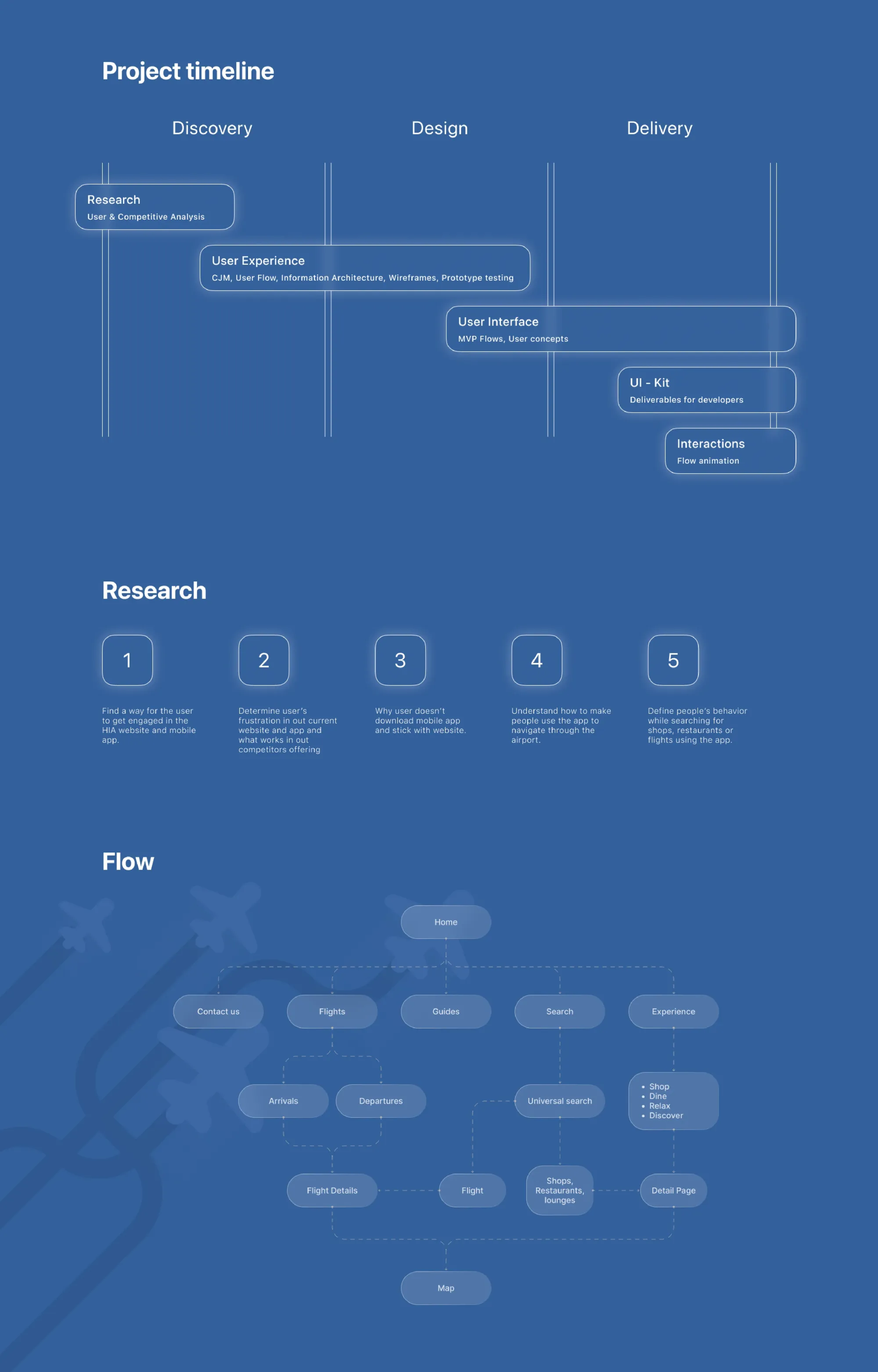
- Led 50+ user interviews and analysed 100+ data points to uncover the key UX opportunities
- Competitive analysis of 40+ airports, including Singapore Changi, Dubai International, Amsterdam Schiphol and London Heathrow
- Identified UX trends and best practices in airport digital interfaces to benchmark a future-proof strategy
- Mapped pain points and opportunities for differentiation against HIA’s premium brand identity
06
Strategic approach
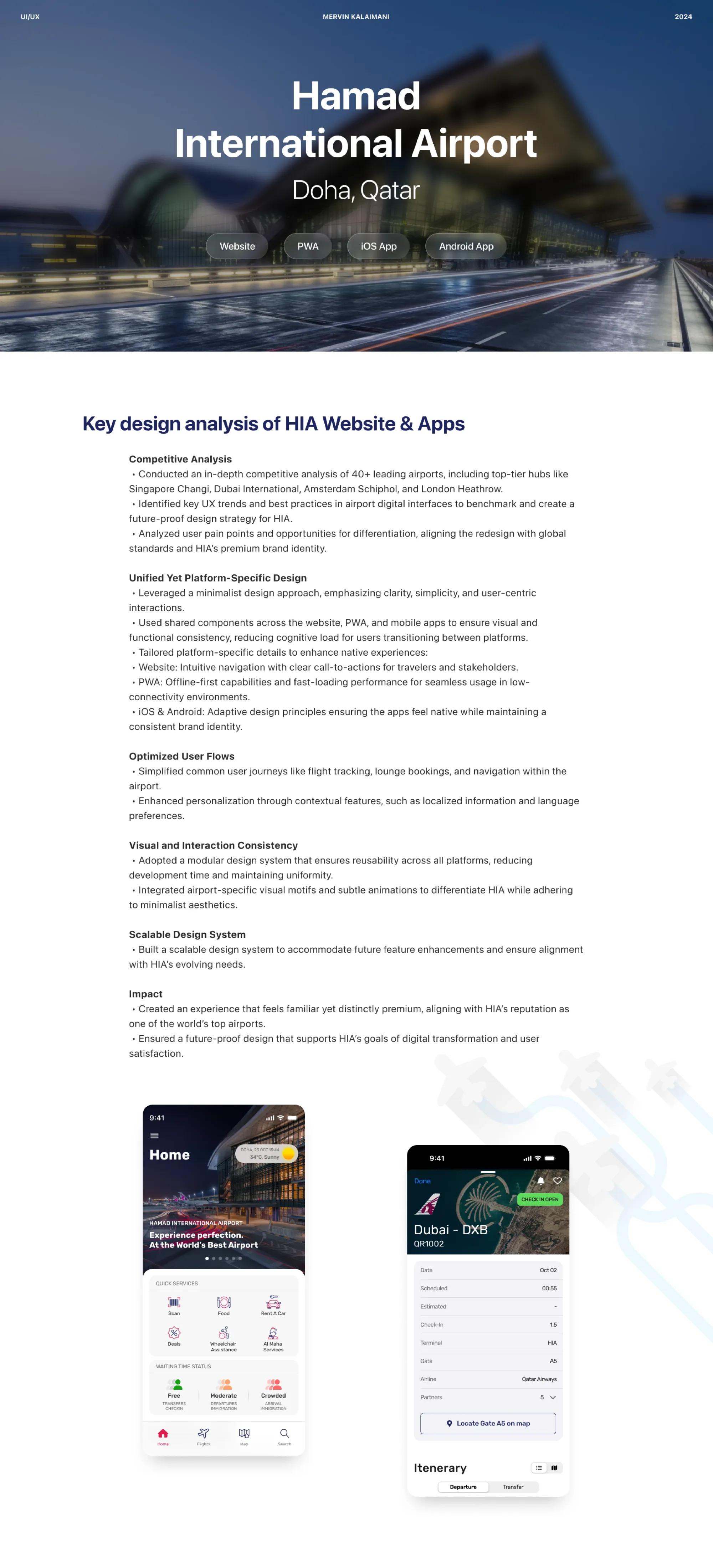
Unified, yet platform-specific. A minimalist approach that puts clarity first, built on shared components so travellers moving between platforms never have to relearn the interface.
- Website — intuitive navigation with clear calls to action for travellers and stakeholders
- PWA — offline-first and fast-loading for low-connectivity moments
- iOS & Android — adaptive patterns following Apple’s Human Interface Guidelines and Google’s Material Design, so the apps feel native while keeping one brand
07
Information architecture
The structure was organised around five primary destinations — Flights, Guides, Search, Experience and Contact. Universal search connects flights, shops, restaurants and lounges, and every path converges on the interactive airport map.
Common journeys such as flight tracking, lounge booking and wayfinding were simplified, with personalisation through localised information and language preferences.
08
Design exploration
The programme moved through Discovery, Design and Delivery: research and competitive analysis; customer journey maps, user flows, IA, wireframes and prototype testing; MVP flows and UI concepts; a UI kit for developers; and flow animations.
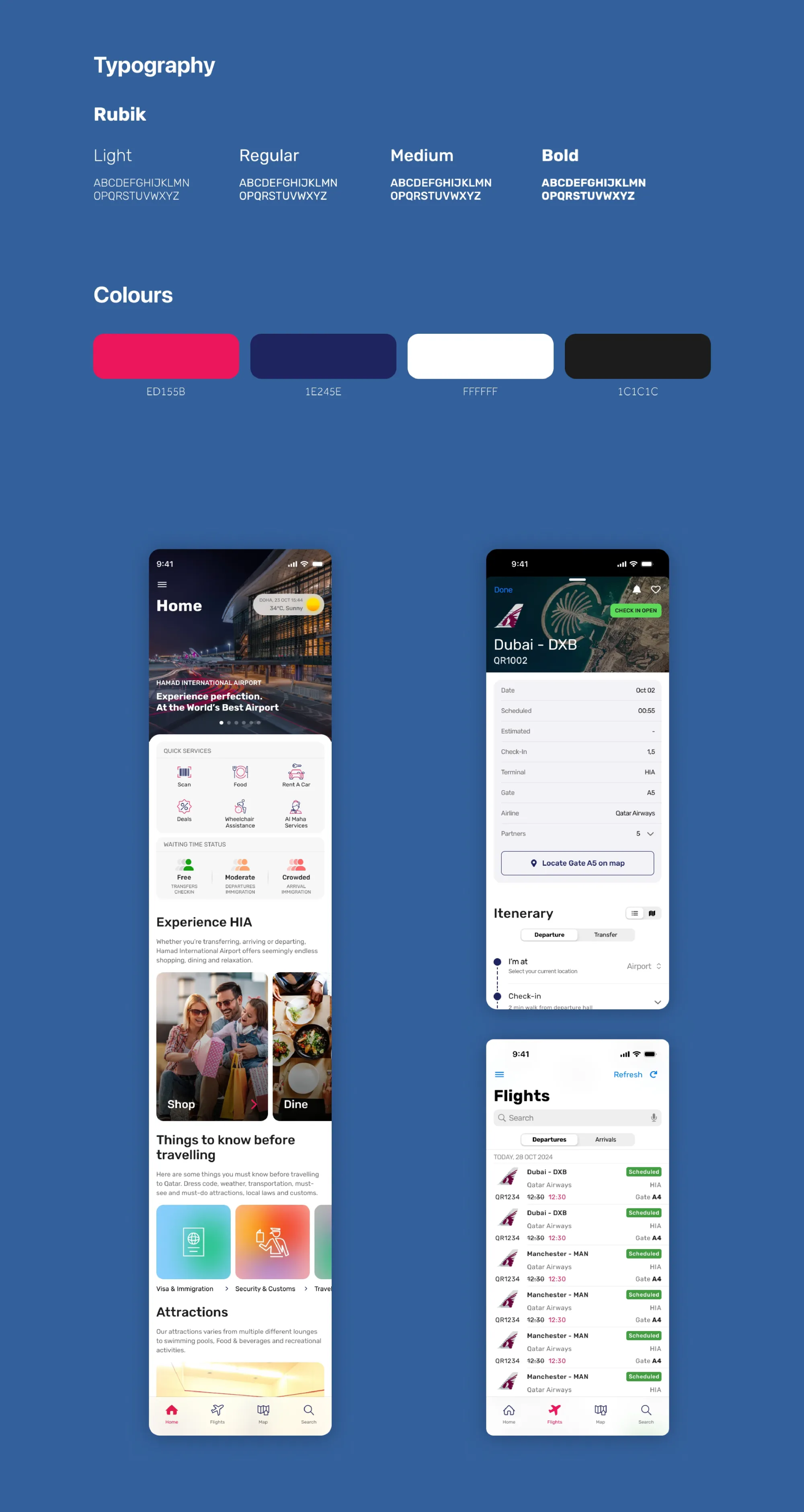
The visual language pairs Rubik with a restrained palette — HIA magenta #ED155B, deep navy #1E245E, white and near-black — with airport-specific motifs and subtle animation to feel distinctly HIA while staying minimal.
09
Final experience
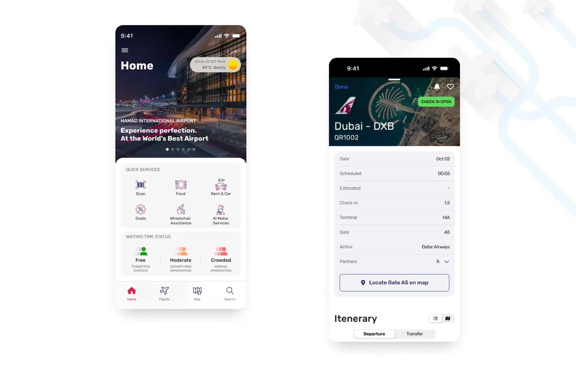
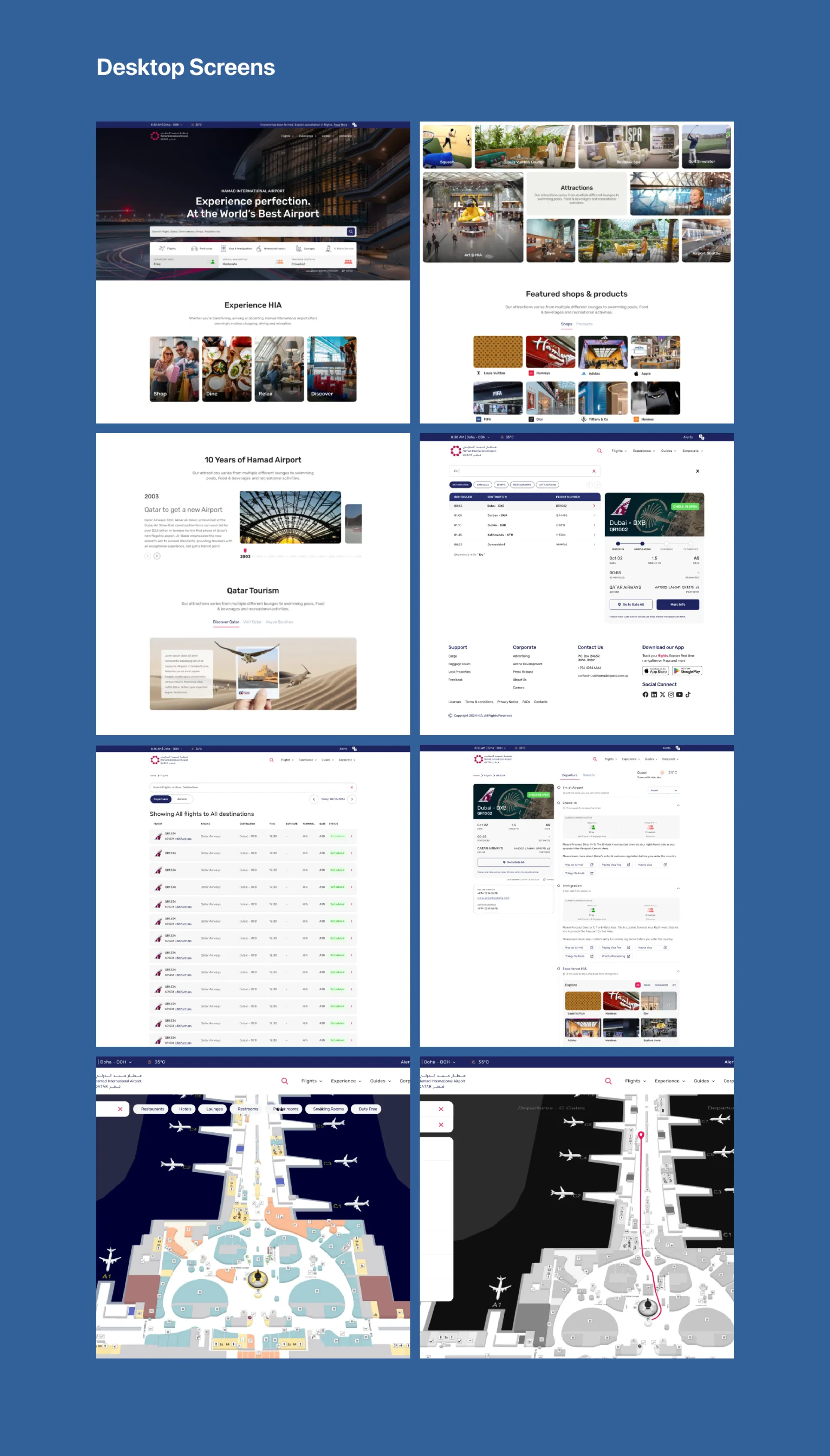
- Home with quick services — scan, food, car rental, deals, wheelchair assistance and Al Maha services
- Live waiting-time status for transfers, departures and arrival immigration
- Flight details with gate information and “Locate gate on map”
- A step-by-step itinerary from check-in to gate
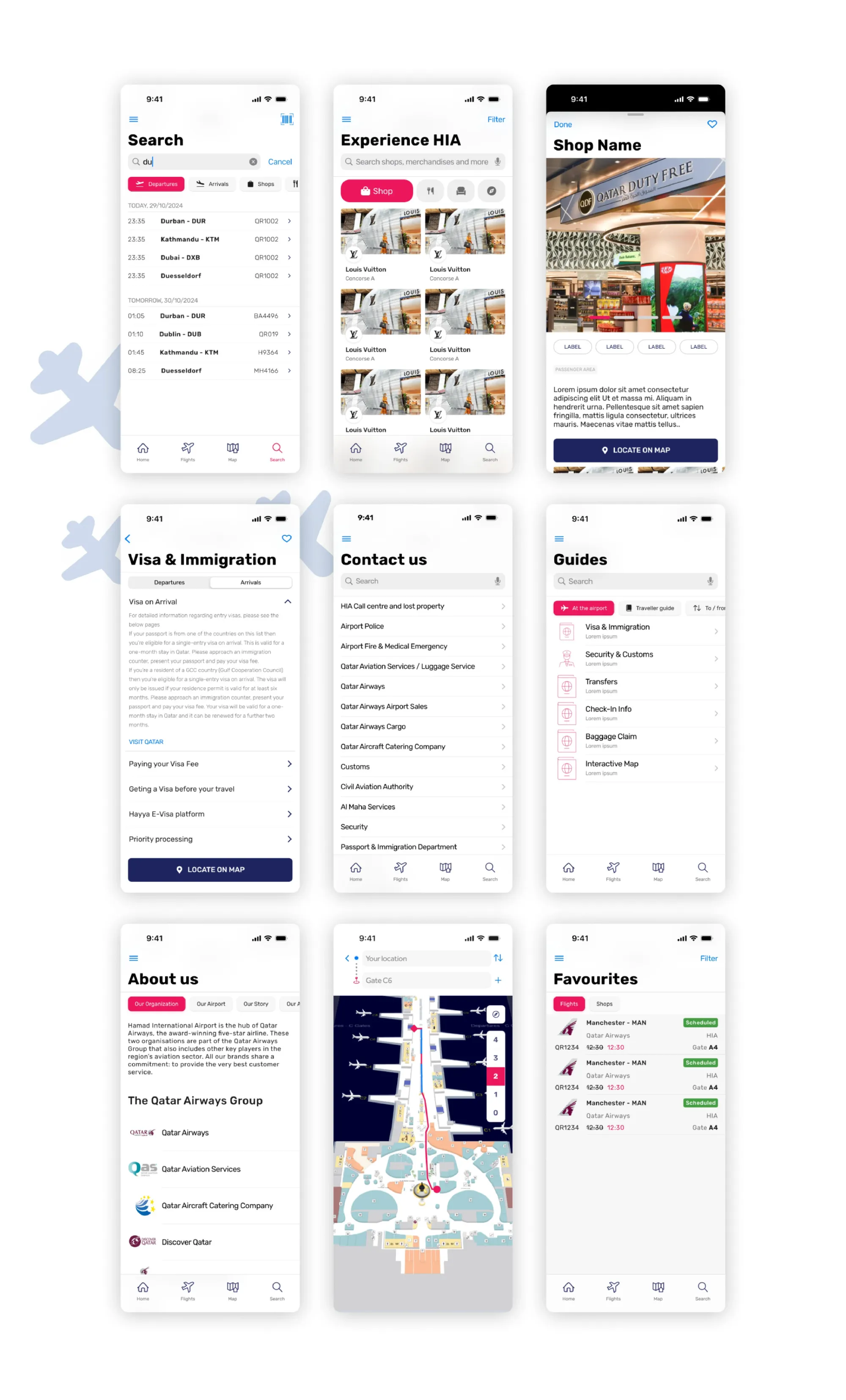
- Experience HIA — shop, dine, relax and discover
- Guides for visa & immigration, security, transfers and baggage
- Indoor map with turn-by-turn wayfinding, plus favourites for flights and shops
10
Impact & outcomes
The redesign created an experience that feels familiar yet distinctly premium, aligned with HIA’s reputation, and a scalable design system ready for future features.
11
My role & contributions
- Led UX end to end: research, strategy, information architecture, interaction and visual design
- Defined the digital strategy across web, mobile and airport kiosks
- Architected and governed the Figma design system — tokens, UX standards and reusable component libraries
- Applied Apple HIG and Material Design for a cohesive cross-platform experience
- Partnered with Virtusa and HIA product, engineering and business teams
12
Tools & technologies
- Figma
- Design tokens
- Apple HIG
- Material Design
- Prototype testing
Visual documentation
Related projects
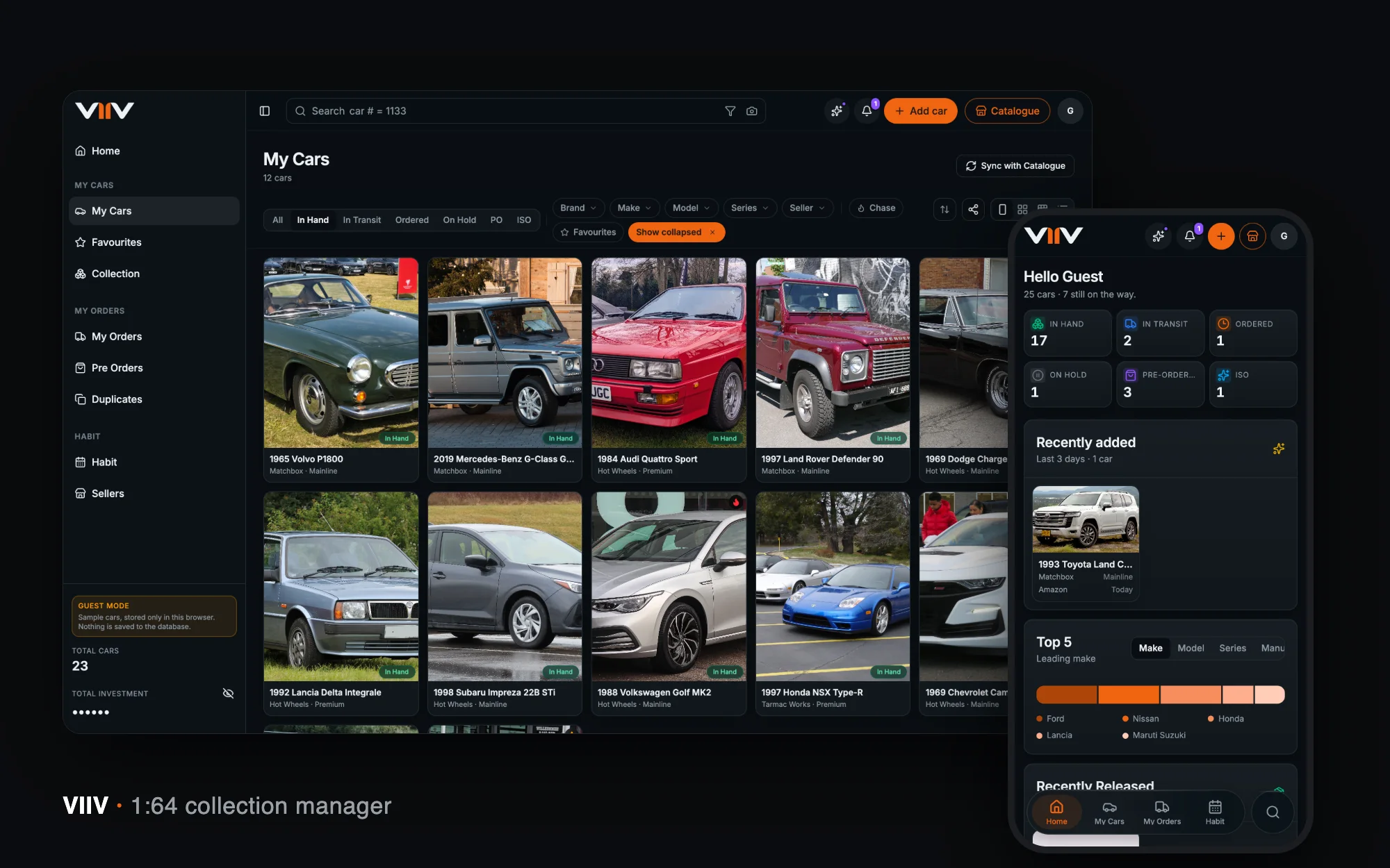
Collectibles · Product Design · 2026
VIIV
A home for a 1:64 diecast collection — catalogue, card scan, orders, spend and habits — designed and built end to end in seven weeks.
View case study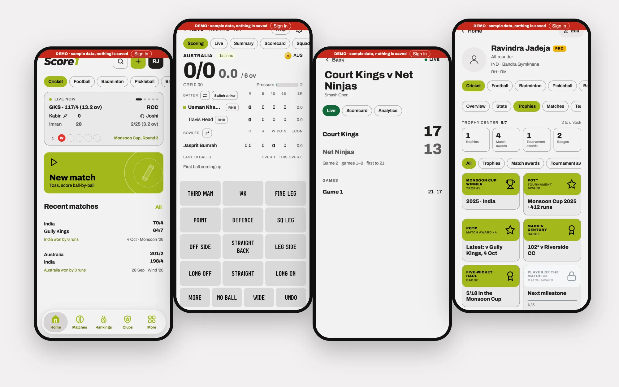
Amateur sport · Product Design · 2026
Score1
One app for scoring, tracking and connecting across nine sports — with the scoring depth cricket needs and the community tools clubs actually use.
View case studyLet’s talk
Have a challenge worth solving?
Whether you’re building a product, transforming an experience or looking for someone to help shape your design direction, let’s talk.