Property and rent · Product Design · 2026
RentPay.
Rent, kept plain.
Rent management for small landlords and their tenants — one shared, trustworthy record of what is due, what was paid and what was said, in plain words.
- My role
- Product designer and owner — product definition, design rules, interaction and visual design — with AI-assisted development
- Duration
- 2 – 4 Nov 2026 · 58 commits · 37 pull requests
- Industry
- Property and rent
- Platform
- Landlord and staff web portal · tenant app (iOS and Android, development build)
- Tools
- Claude Code · React · Vite · Hono · Cloudflare Workers · Neon PostgreSQL · Clerk · Resend · Expo
Overview
The product, plainly
- What it is
- RentPay is rent management for small landlords and their tenants. The landlord portal handles properties and flats, tenants (current and former), rent setup and planned changes, payments and corrections, deposits and advances, reminders, emailed receipts, repairs and complaints, private messages, notices, lost and found, and a rental agreement built from the tenant’s records. The tenant app shows what is owed and when, rent month by month, payments, the deposit, and lets a tenant report a problem with photos.
- Why it exists
- A rent record is only worth having if both sides can trust it. My premise: money, tenancy and message history should never be quietly overwritten, and the words on screen should be the words people already use.
- Who it serves
- Small landlords with a handful of flats, the family members or staff who help them, and tenants — including older adults and people who prefer simple screens.
- The problem
- Rent lives in notebooks, spreadsheets and chat threads that disagree with each other. Accounting software is built for accountants. A small landlord needs something between them: a record that is accurate, readable and shared.
- My contribution
- Product definition, the design rules (size, contrast, words, records), information architecture, the rent and payment flows, the visual system and its dark mode, the phone layout, and the direction of an AI-assisted build across 58 commits.
58
commits in 3 days (2 – 4 Nov 2026)
37
pull requests merged
241
automated tests, all passing at the last deploy
7:1
minimum body-text contrast in the design rules
Stage 1 of 5 · Empathise
Start from the small landlord
Research and discovery
I didn’t interview landlords or tenants for RentPay, and I won’t pretend otherwise. The brief named two groups — a small landlord with a handful of flats, and tenants who include older adults and people who prefer simple screens — and the design rules that came out of it are written down. This stage says what that brief assumed, and what I still haven’t asked anyone.
What kind of evidence is in this stage
- Research conducted
- Provisional persona
- Proposed validation — not yet run
Two people, one record. Rent has a landlord side and a tenant side, and they look at the same facts differently:
- The landlord wants every flat’s month in one view: due, paid, part-paid, late — and a receipt trail that holds up if someone disagrees.
- The tenant wants one answer at the top of the screen: what do I owe, and by when.
- Staff (a caretaker or a family member helping) need to record a payment without being able to change the money rules.
A rent month, from both sides
Conceptual diagram- Landlord checks who has paid
- Tenant sees the amount and the due date
- Reminder is sent automatically
- Tenant confirms they received it
- Tenant pays by bank transfer or UPI
- Landlord records the payment, full or part
- Receipt is emailed
- Payment shows on both sides
- A wrong amount or date is noticed
- “Who is still outstanding?”
- “How much, and by when?”
- “Did they see my message?”
- “Is it recorded?”
- “Now there’s proof.”
- “Can this be fixed without a row of crossings-out?”
- One screen that answers both questions in words, not colours alone
- “Reminder received” — the landlord sees who confirmed and when
- One click to record; the tenant confirms it
- A receipt that needs no explanation
- Correct it, keep the original, show the reason
The owner of a few flats
Small landlord, often with no staff
Manages a building or two, sometimes with a family member helping. Wants the month’s money to be obvious and the history to be trustworthy. Not an accountant.
Wants
- See every flat’s month at a glance
- Record a payment in one step
- Send a notice to one flat, one building or chosen buildings without a mistake
Struggles with
- Notebooks and chat messages that disagree
- Chasing the same person every month
- No receipt to point to
The tenant who prefers simple screens
Pays monthly; may be older
Opens the app to answer one question. Reads text carefully and will not hunt for it. Provisional — written from the brief, not from a person.
Wants
- Know what is due and when
- See that a payment was recorded
- Report a repair with a photo
Struggles with
- Small text and low contrast
- Icons with no words
- Being unsure whether a payment counted
Key insights
- 01A small landlord keeps rent in a notebook, a spreadsheet and a chat. The job is to know, for every flat and every month, what was due, what was paid and what is still owed. (Design assumption.)
- 02Money disputes are about records, not arithmetic. “I paid on the 5th” needs a dated, visible record that both sides can see. (Design assumption.)
- 03Many tenants are older, or simply don’t want a clever app. The brief says so in its first lines: simple screens first. (Stated in the project’s design rules.)
Decisions made
- 01Treat plain language as a requirement: say “rent”, “payment”, “deposit”, “repair”; keep words like ledger, accrual and arrears out of the interface.
- 02Give tenants a view of their own records, not only the landlord — a record both people can read settles more arguments than one only the landlord holds.
- 03Be explicit in the case study that this is a designed-and-built product with no field research behind it yet.
With the people named and the research gap admitted, the next job was to say what problem RentPay is actually for.
Next: DefineStage 2 of 5 · Define
Records that can’t be quietly changed
Problem framing and strategy
Rent software is only useful if both sides trust what it says. That turns one design problem into a rule: money, tenancy and message history is never overwritten, and mistakes are fixed by a visible correction. The harder part was deciding how strict that rule should be for the person typing at the end of a long day.
What kind of evidence is in this stage
- Retrospective analysis
The problem, in one sentence. Give a small landlord and their tenants one shared, trustworthy record of rent — in words they already use — without the software turning into accounting.
First rule
- Money records are never edited or deleted
- Any mistake needs a linked correction
- Safe, but a typo costs a correction and a reason
- Payments blocked editing the month they belonged to
Rule after real use
- Edit or delete freely until the tenant confirms
- Once confirmed, rent amounts and payments lock
- After that, a linked correction with a reason
- Editing a month is not blocked by payments in it
0
floating-point amounts: money is whole minor units
1
currency stored on every money record
∞
history kept: nothing that touches money is overwritten
Source: Design rules
Key insights
- 01The records that matter most — what was paid, what was owed, what was said — are the ones people argue about later. They must outlast the mood of the moment. (Design assumption.)
- 02A rule that is too strict punishes ordinary typos. A rule that is too loose makes the history worthless. The right line is “until the other person has seen it”. (Observed in the product: PRs 11 and 12 moved the line.)
- 03Money has a currency, and a flat abroad has a different one. A saved amount must carry its own currency, never inherit the account default. (Stated in the design rules.)
Decisions made
- 01All amounts are stored as whole minor units (paise, cents), never floats; every record stores its own currency.
- 02Corrections and reversals link to the original and give a reason. Both stay visible; the database refuses edits and deletes of those records.
- 03Until a tenant confirms a payment, the landlord can still edit or delete it. Once confirmed, it locks and only a correction can change it.
- 04Planned rent changes carry a start date and are kept in history; they stay private to the landlord until they are shown to the tenant.
With the rule set — never overwrite, always correct — the structure had to be decided: what is shared, who sees what, and what belongs to a role.
Next: IdeateStage 3 of 5 · Ideate
One record, three ways in
Exploration and solution architecture
A landlord at a desk, a tenant on a phone and a caretaker with a few permissions all need the same facts. The architecture answer is a shared core — tokens, money, dates and regions — with a landlord portal, a tenant app and one API that applies the access rules in a single place.
What kind of evidence is in this stage
- Design assumption
How it fits together
Drawn from the shipped productShared core
One source of truth for how things look and add up
- Design tokens
- Money (minor units)
- Dates and regions
- Currencies per record
API
Applies the access rules once
- Cloudflare Worker (Hono)
- Neon PostgreSQL
- Email-code sign-in (Clerk)
- Receipts and reminders (Resend)
- Photos (R2)
Landlord and staff portal
- Properties and flats
- Tenants, current and former
- Rent, payments, corrections
- Repairs and complaints
- Notices and messages
- Rental agreement
Tenant app
- What is owed and when
- Rent month by month
- Payments and deposit
- Report a problem with photos
- Messages and notices
- Lost and found
A payment, from record to receipt
Drawn from the shipped productWhat each side can do
Drawn from the shipped product| Owner | Staff | Tenant | |
|---|---|---|---|
| See what is owed and when | |||
| Record a payment | — | ||
| Edit or delete a payment (until confirmed) | — | ||
| Confirm a payment | — | — | |
| Rent reminders | |||
| Report a repair with photos | |||
| Send a notice | — | ||
| Private messages | |||
| Pay in the app (needs a gateway) | — | — |
- Built
- Built, limited by role
- Needs a gateway to be connected
Key insights
- 01Desktop first for the landlord, mobile first for the tenant. The portal works on tablets, and tables stack into cards on phones. (Stated in the design rules.)
- 02Roles decide what each person sees, and the rules live in the API, not in each screen. (Observed in the repository: central access rules.)
- 03Paying in the app should not depend on a gateway the landlord hasn’t chosen. The product ships the connection point, not a gateway. (Observed: “Pay now” appears only once one is connected.)
Decisions made
- 01A shared package holds design tokens, money, dates and region settings, so the portal and the app can’t drift apart.
- 02Realtime updates in the portal, so a payment recorded by staff appears for the owner without a refresh.
- 03Where a flat’s tenant pays — a UPI ID, a QR image or a link — is set per flat, for rent and for maintenance.
- 04Notices go to one flat, one property or chosen properties, and the recipients are checked before sending.
The architecture was settled. The question became how plain it could be made — where the rules for older eyes and thumbs would be written down.
Next: DesignStage 4 of 5 · Design
Plain words, big targets, one teal
Wireframes, UI and prototyping
The design rules were written before the first screen. Body text is 17 px, the smallest text anywhere is 14 px, tap targets are 48 px, body-text contrast is at least 7:1, and colour is never the only cue — “Overdue” is a word. When a rule and a visual idea disagree, the rule wins. The look came later and had to fit inside them.
What kind of evidence is in this stage
- Retrospective analysis
The palette
Drawn from the shipped productSystem font stack · 17 px body, 18 px for amounts and dates, 40 px for the one number that matters
Rent due Monday, 2 Nov 2026
- 2 Nov
Payments as a table, most recent first
- 2 Nov
Rent and payments in one table
Two lists became one, so a month and what was paid against it sit together.
- 2 Nov
Compact rows, month bands, small actions, status pills
- 3 Nov
Rent and payments stack in one column
- 3 Nov
One row per month, with email, edit and delete icons
- 3 Nov
One pencil per month
Choose whether you are editing the payment or the amount owed.
- 3 Nov
A month-only first column, a separate Paid column and year tabs
- 3 Nov
Rent history uses the same table, with rent and maintenance in separate columns
The phone. On 4 Nov the portal got a phone layout: a sidebar drawer instead of a permanent sidebar, compact property cards, and an accordion rent list that opens one month at a time. Settings was cut down to a single row per setting, with the long descriptions removed — a rule from the design rules in action: short sentences, one idea per sentence.
Key insights
- 01Rules written first are cheaper than fixes later. Every screen was checked against them rather than against taste. (Observed: the rules are in the repository from the first day.)
- 02The rent table was the screen that was redesigned the most: about a dozen pull requests in two days, always toward fewer columns and one clear action per row.
- 03The Apple-style redesign — deep teal, a lighter sidebar, dark mode that follows the system — made the portal calmer without breaking a single contrast rule.
Decisions made
- 01One accent, deep teal (#005E4F, 7.7:1 on white), with a separate focus colour so focus never looks like selection.
- 02Dark mode follows the system setting; there is no in-app switch. Dark colours meet the same contrast rules.
- 03On a phone, the portal gets a drawer and compact cards; the rent list becomes an accordion; Settings becomes one plain row per setting, like iOS Settings, with no descriptions.
- 04Every button has a text label. Icons may sit beside the words, never replace them.
Rules and look were in place. How was it checked, and what has not been checked at all?
Next: TestStage 5 of 5 · Test
What is checked, and what is not
Validation, iteration and improvement
RentPay has automated checks and no usability testing. I want those two facts kept apart. A passing test suite says the money adds up and the access rules hold. It does not say a 70-year-old tenant can find what is due. The first is done; the second is the next piece of work.
What kind of evidence is in this stage
- Retrospective analysis
- Provisional persona
- Proposed validation — not yet run
- Future opportunity
241
automated tests, all passing at the last deploy
37
pull requests merged in three days
58
commits, 2 – 4 Nov 2026
7:1
minimum body-text contrast in the rules
Source: Design rules
Key insights
- 01Before each of the latest deploys the full test suite and the type check were run. At the last one that was 241 tests, all passing.
- 02Money, dates, regions and the access rules are exactly the parts that tests can protect, and they are the parts that must never be wrong.
- 03The rules about older eyes and thumbs — size, contrast, words — are written down and applied, but they haven’t been tested with the people they are for.
Decisions made
- 01Keep the records rule enforced in the database, not only in screens: it refuses edits and deletes of money, tenancy and message history.
- 02Say plainly where it stands: the landlord portal is deployed; the tenant app runs in a development build and is not yet published.
- 03Never claim usage or outcome numbers until there are verified ones.
That leaves the honest end of the story: what the numbers are, and what would show whether RentPay works.
What I learnedReflection
What I took from it
01
What I learned
A rule that is too strict is as harmful as no rule. “Never edit money” sounded safe and failed in a day; “edit until the tenant has seen it” was kinder and more honest. Designing the moment of confirmation did more for trust than any screen did.
I also learned how much writing the rules down first is worth. When the rules say 48 px, 7:1 and “say what happens”, a redesign becomes a matter of checking, not arguing.
02
Key design decisions
- Money is whole minor units, with a currency on every record.
- Edit freely until the tenant confirms; after that, a linked correction with a reason.
- The database refuses edits and deletes of money, tenancy and message history.
- Plain words in every screen; no word that needs a glossary.
- One teal accent, system-following dark mode, and a text label on every button.
- Ship the portal first; the tenant app and the payment gateway follow.
03
Product impact
Not measured. RentPay is days old. I am not publishing usage numbers because I have no verified ones. What I can state: it was designed and built in three days, the landlord portal is live, and 241 automated tests pass.
04
Opportunities for future development
- Test with real tenants and landlords (plan under Test).
- Connect one payment gateway so tenants can pay in the app.
- Publish the tenant app to the stores.
- More regions and currencies.
- A calmer first-run for a landlord with one flat.
“Good design isn’t just about creating interfaces. It’s about understanding people, connecting ideas and making complex experiences feel simple.”
Related projects
Collectibles · Product Design · 2026
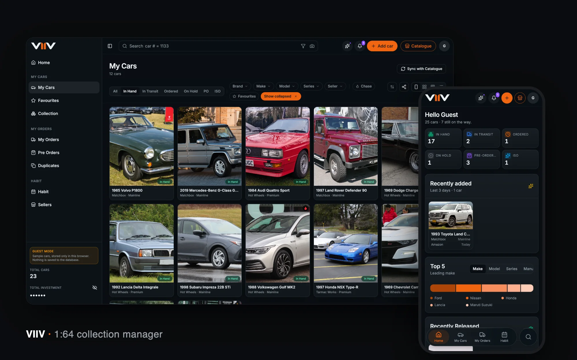
VIIV
A home for a 1:64 diecast collection — catalogue, card scan, orders, spend and habits — designed and built end to end in seven weeks.
View case study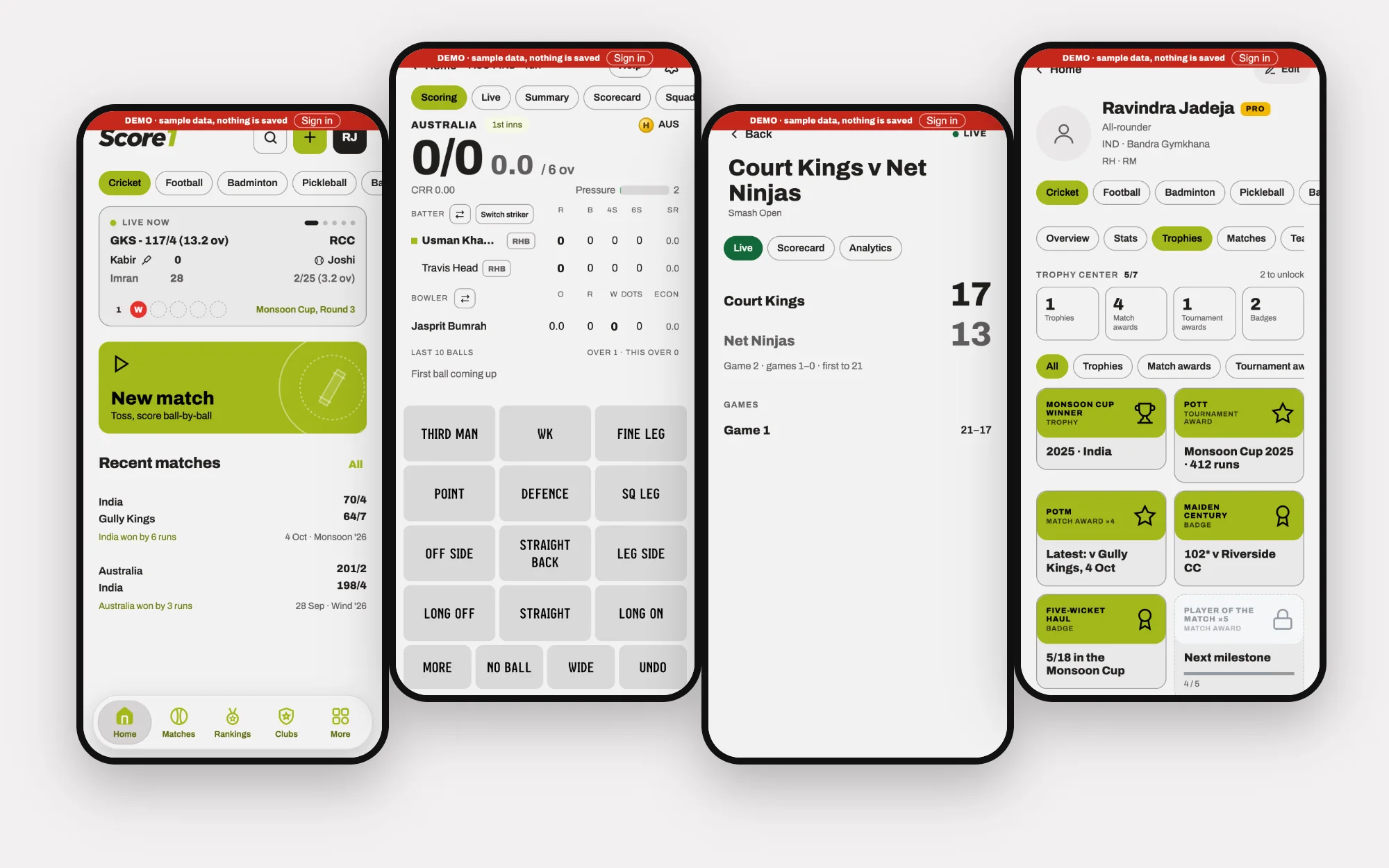
Amateur sport · Product Design · 2026
Score1
One app for scoring, tracking and connecting across nine sports — with the scoring depth cricket needs and the community tools clubs actually use.
View case studyLet’s talk
Have a challenge worth solving?
Whether you’re building a product, transforming an experience or looking for someone to help shape your design direction, let’s talk.